
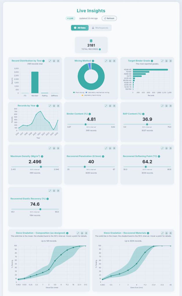
The AsphaltMine visualization tool is available to any unregistered user. Users can view mean values, uncertainty ranges, and record counts, and can select individual charts to inspect detailed distributions. Upon registration, users gain access to filter data by workspace, mixture type, year, and binder grade, with further options planned for future development. This allows users to focus on specific mixture groups or time periods and assess whether enough relevant data are available for a particular analysis. The visualizations of sieve gradation, binder content, RAP content, and other parameters also provide a rapid understanding of the composition and variability of the available mixtures.
The platform also includes a live correlation matrix that reports both Pearson and Spearman correlation coefficients, together with the number of paired records used for each calculation. This helps users investigate meaningful relationships, distinguish general trends from possible outliers, and evaluate whether a correlation is supported by a sufficient number of records.
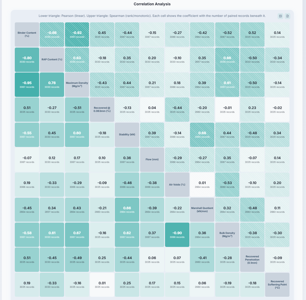
The distribution and scatter plots for each field can be viewed by clicking the corresponding card or grid. Images can also be downloaded easily.
Make sure to try the tool and explore AsphaltMine growing data.